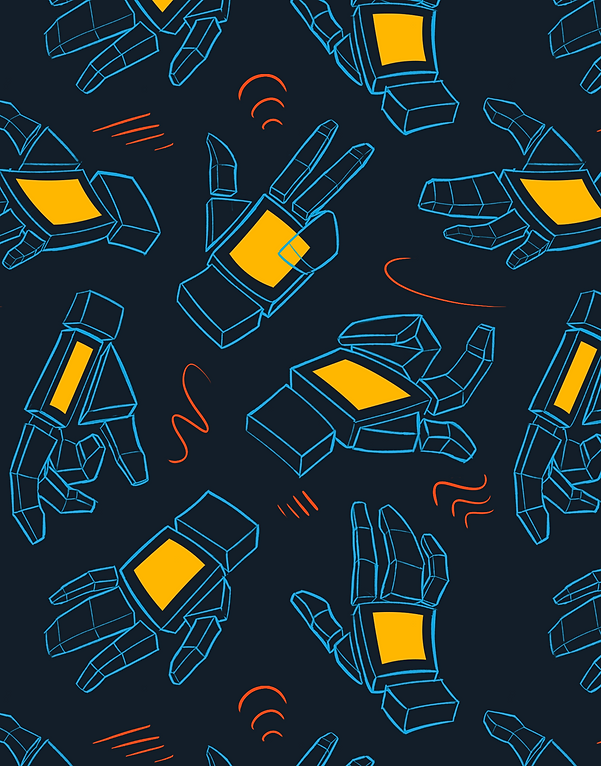

Pattern Design
Ideation
I knew from the beginning that I wanted to do something that I drew, so I figured that I could use this project as an opportunity to practice something that I've been meaning to improve on for a while: Hands!
I started out by doing a series of hand studies. For this first attempt, I tried to be very true to life. They turned out well, but they didn't really mean all that much to me. As a result, I changed them to be more about the process of drawing hands rather than the actual hands themselves. Now each shape represents the way you can break down a hand to make it easier to draw. After that I added a few more elements that I could add some extra color to, like the rectangles on the faces of the hands and the marks in between the different hands. After that, I was done with the base pattern.
My secondary pattern was a lot easier. Using the geometric hand idea from my previous pattern let me come up with a simple, geometric hand that I could repeat endlessly to make an effective pattern.
Colorways


By pivoting away from doing realistic renders of hands, I had less trouble printing my final images due to the less complex shapes that I had to expose on the screen.
Next, I had to add some color to the image.
I wanted the colors to be visually distinct and to have an appealing complementary color palette. I decided on a color palette featuring cyan, reddish-pink, and orange, and white.
Screenprinting
The actual process of making the screens went fairly smoothly. The most challenging part was simply making sure I remembered how to screen print, as it had been upwards of 2 years since I last did anything like this. Thankfully, my pattern was a lot of lines and small shapes, so the inks had minimal chance of pooling too thickly, making the overall process easy to do.


Print Collection
After doing the prints by hand, I went back and changed up the color palette. Reddish-pink, white, and blue are colors that I really enjoy using, but I feel I fall back on them a bit too often, so I changed reddish-pink to yellow to change it up a bit. I also adjusted all the other colors to be Pantone colors, so they could be printed without issue.
I'm pretty satisfied with how the final prints turned out. I feel like the color palette and the imagery are more versatile than I initially thought, and I found that you could apply the pattern to a variety of objects, such as socks, mugs, and pillows. If there was one thing I would improve, however, it would be the line weight on some of the lighter background prints, particularly the yellow background print. The orange hands get a bit lost and I think it could be improved a bit.


